OUR NATIONAL CONVERSATION (ONC) seeks to become a gathering place where citizens from all walks of life can engage in intelligent, civil, and inclusive conversations about politics and public policy. We are part media company, part think tank, part social movement. Our goal is to produce practical, innovative, and nonpartisan proposals designed to make America a better country. We want our work to be so good that those in positions of authority simply must pay attention – and act.
Logo Re-Design
Here I was tasked with redesigning their original logo design (Original Logo Design no 1). I decided to create three different variations that follow different design ideas.
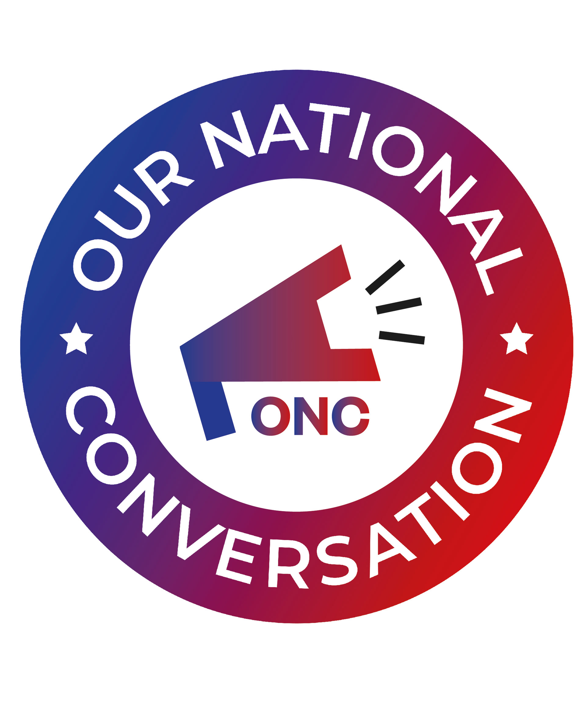
Firstly, I wanted to use the idea of a megaphone as if the information that the company is providing is being promoted loudly. I really like this outcome and the feedback I received from this was positive from the rest of the team- "Had a group meeting, some of us really like the logo with the megaphone. It looks great, love the idea".
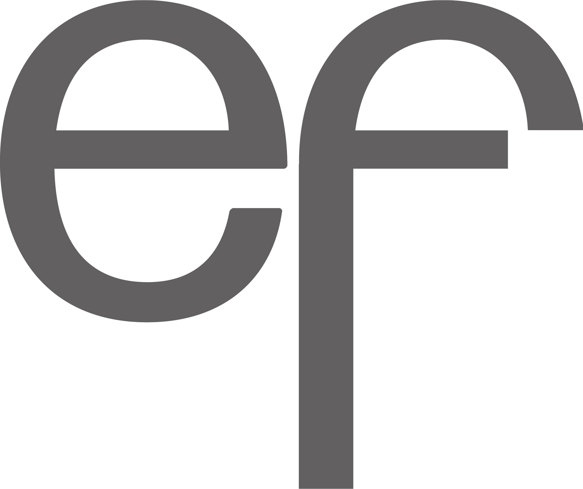
I then went tried incorporating a speech bubble into the centre of the logo, I found that if I tried to centre the speech bubble it meant that the arrow coming off was then overlapping the text. I decided to turn this into part of the 'i' which I feel works well.
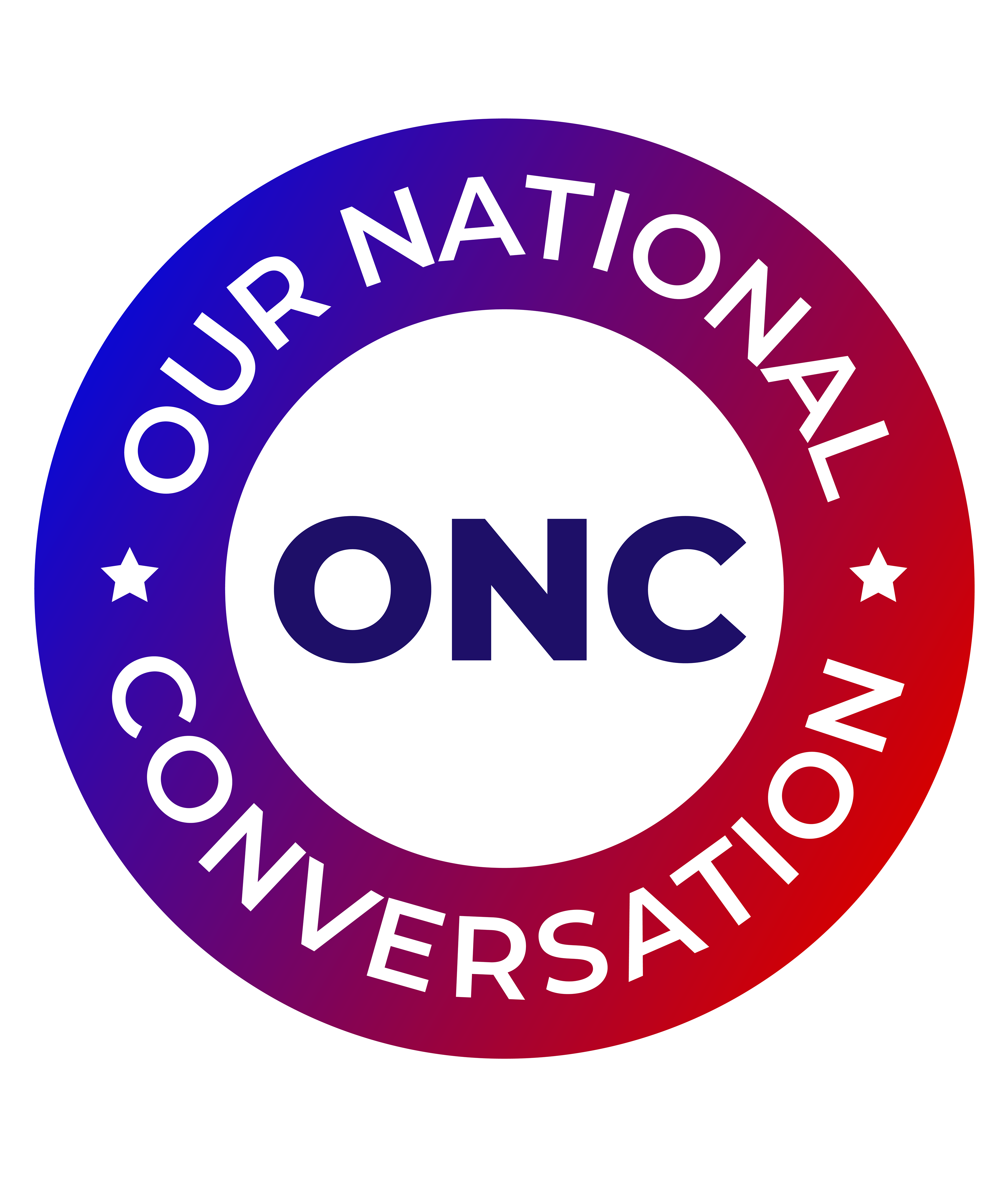
My final design idea was following the instructions of my 'Editor-in-Chief'. He wanted a speech bubble filled with purple colour and then the letters ONC in white.

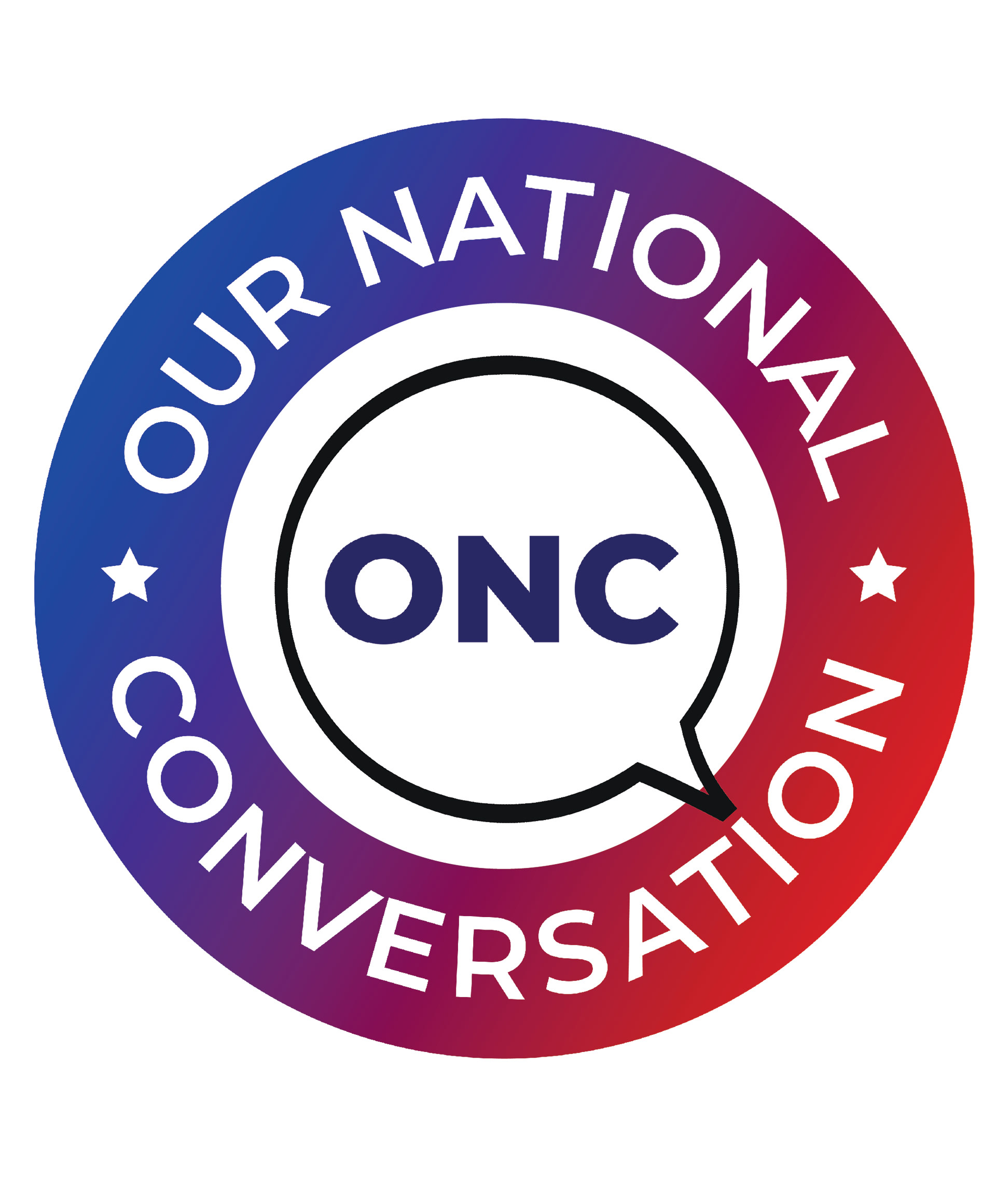
Original Logo Design
Megaphone Edit
Speech Bubble Edit 1
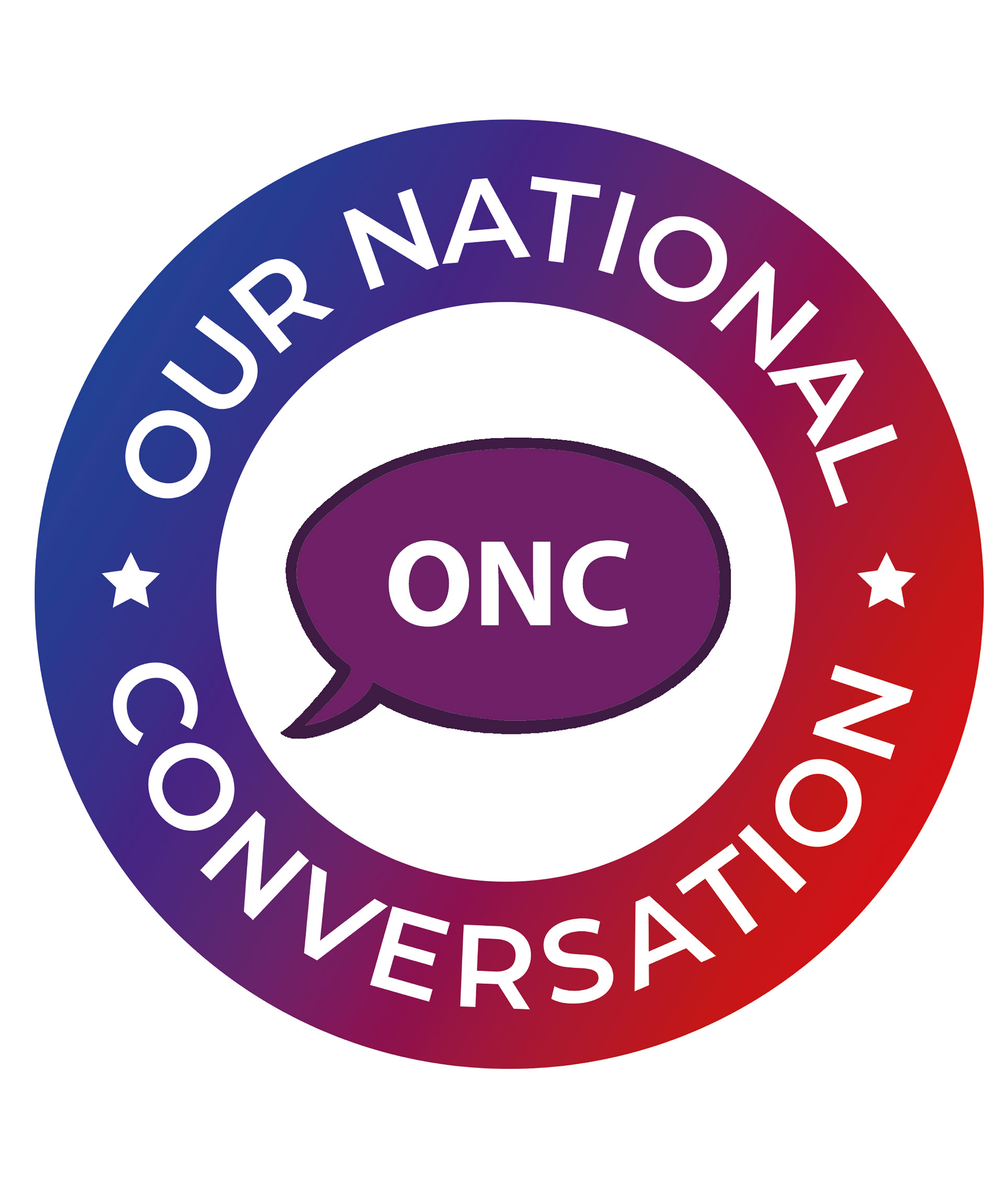
Speech Bubble Edit 2
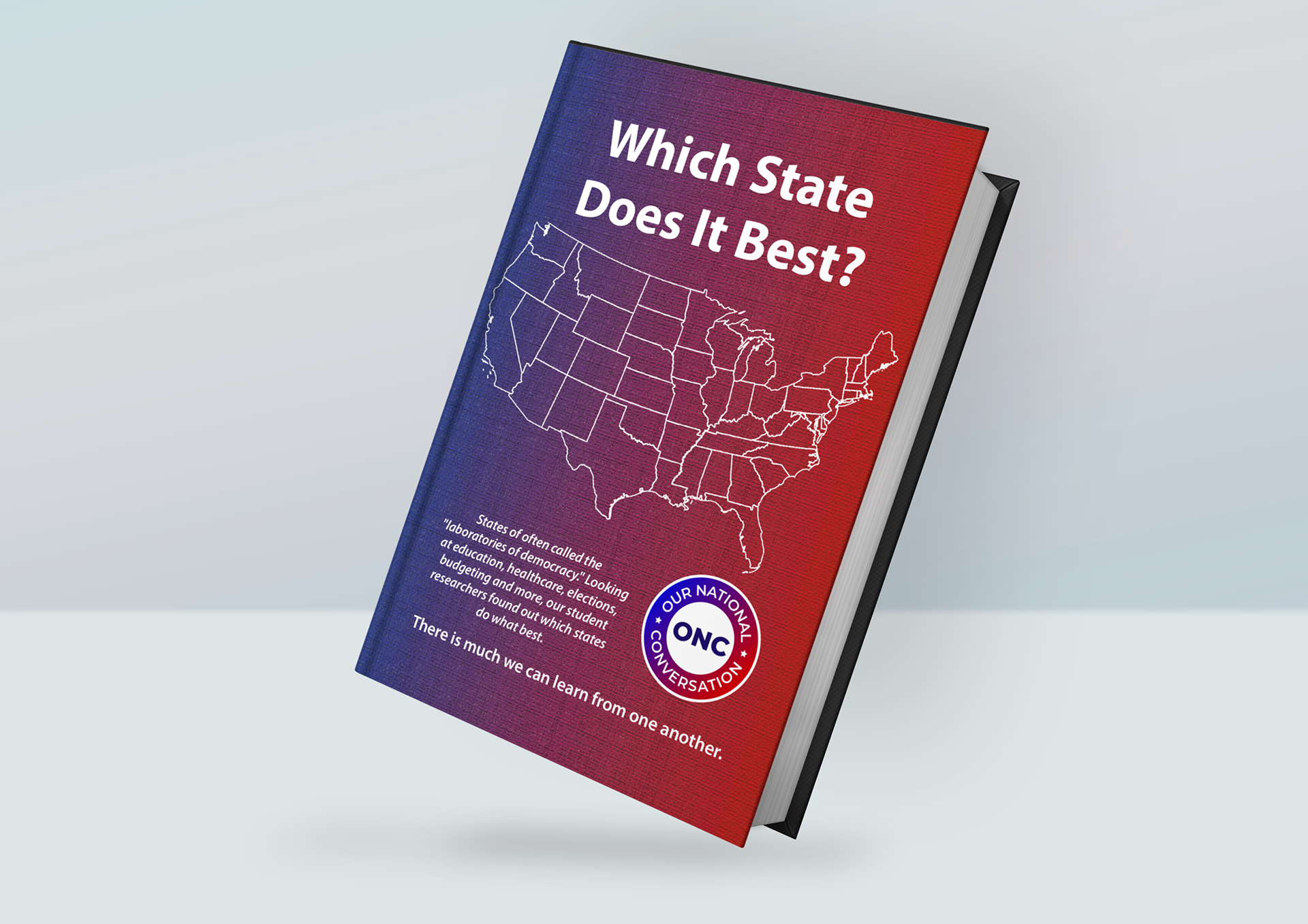
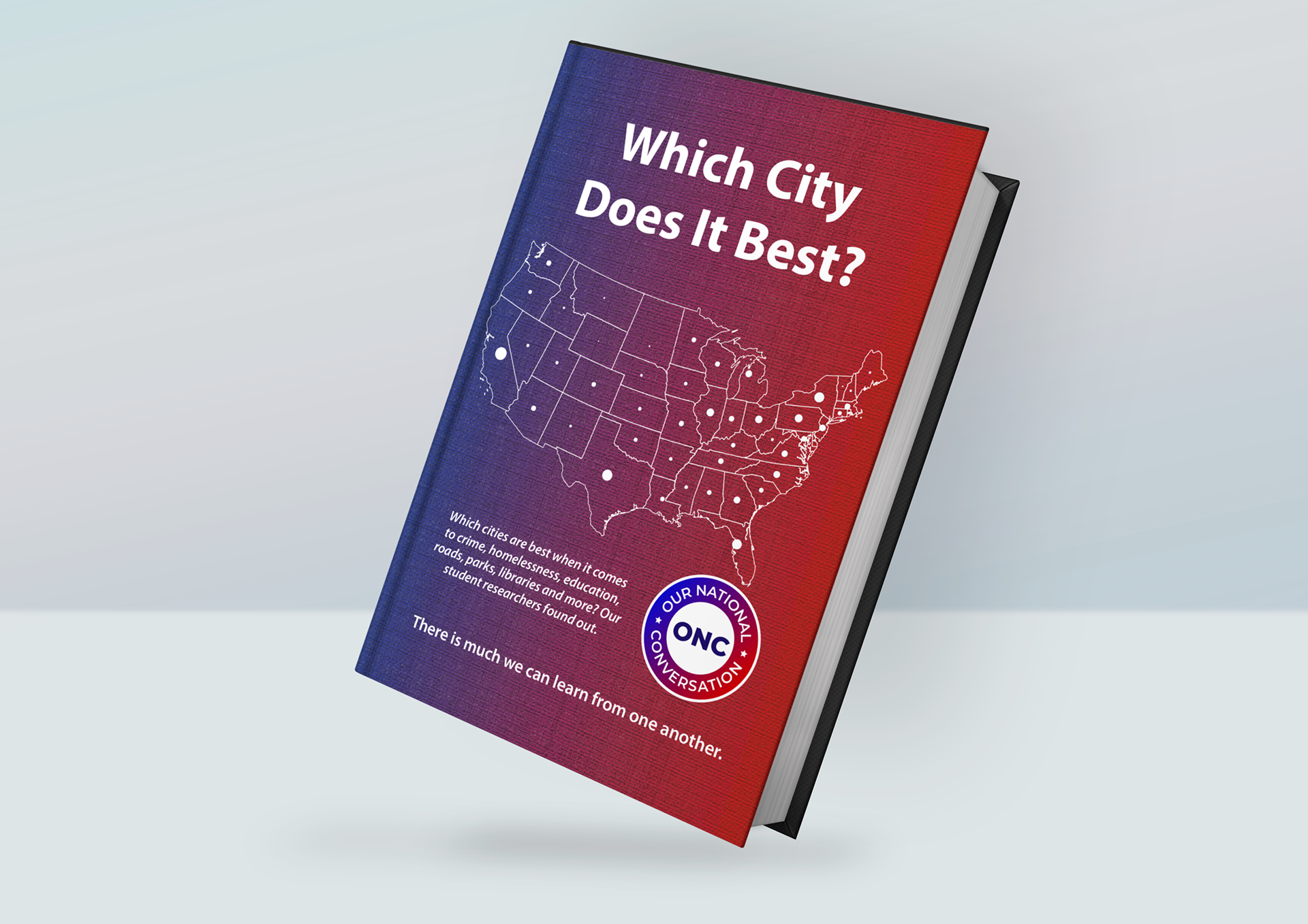
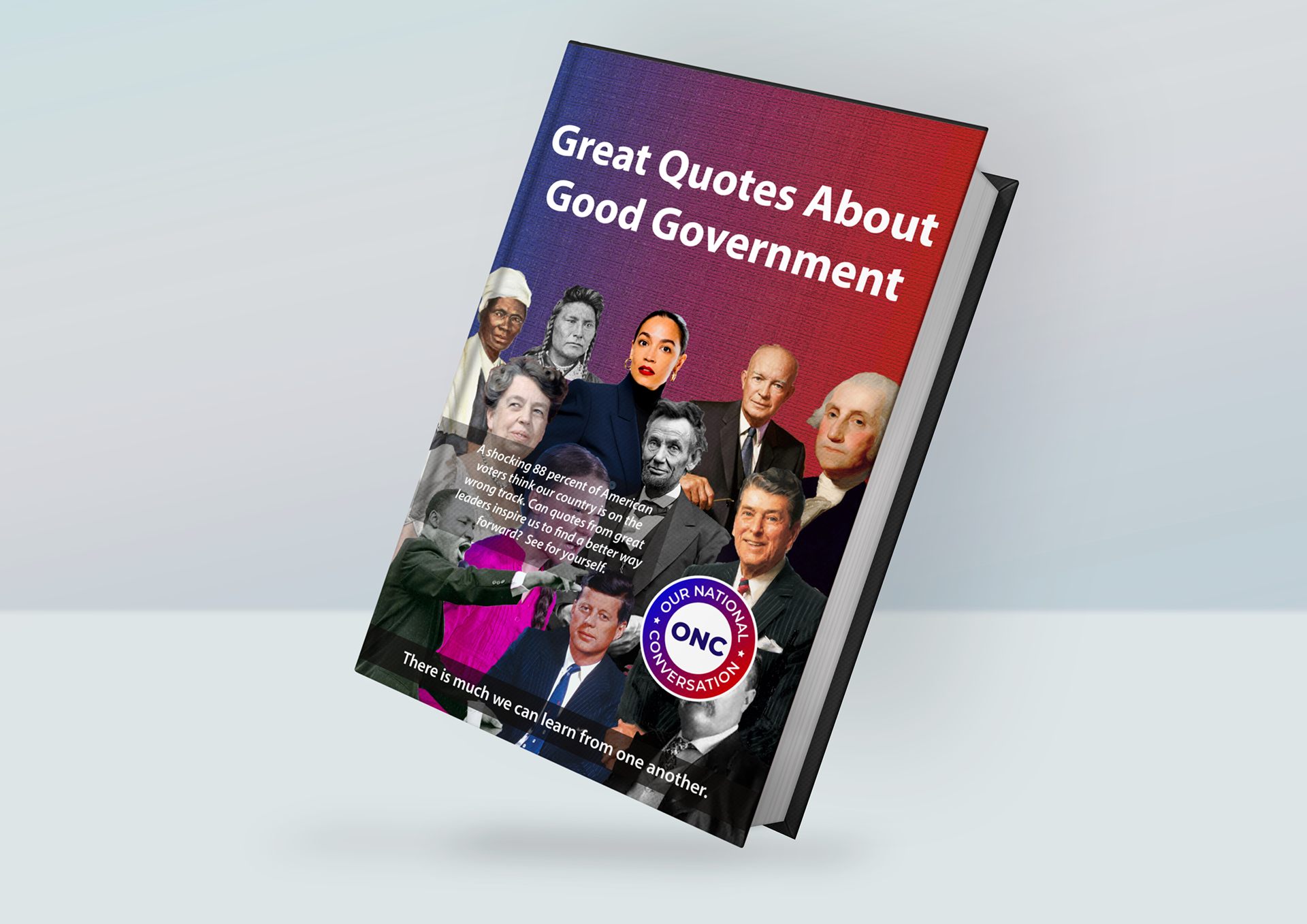
Book Front Cover Design
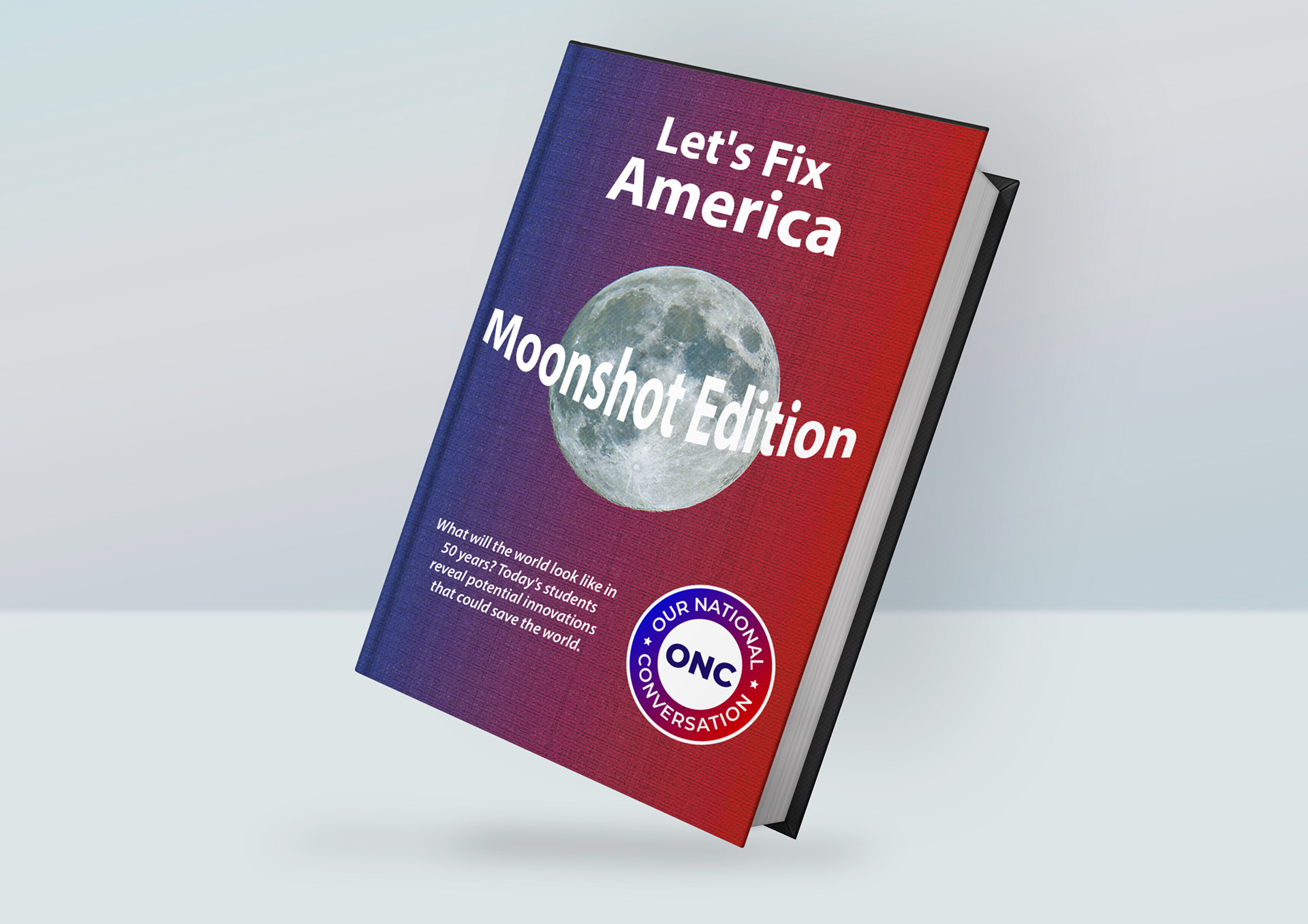
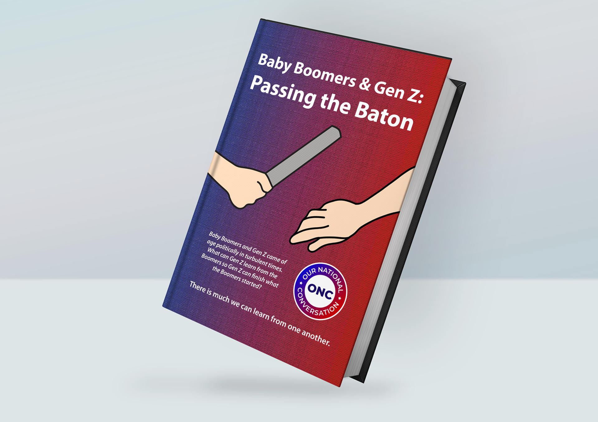
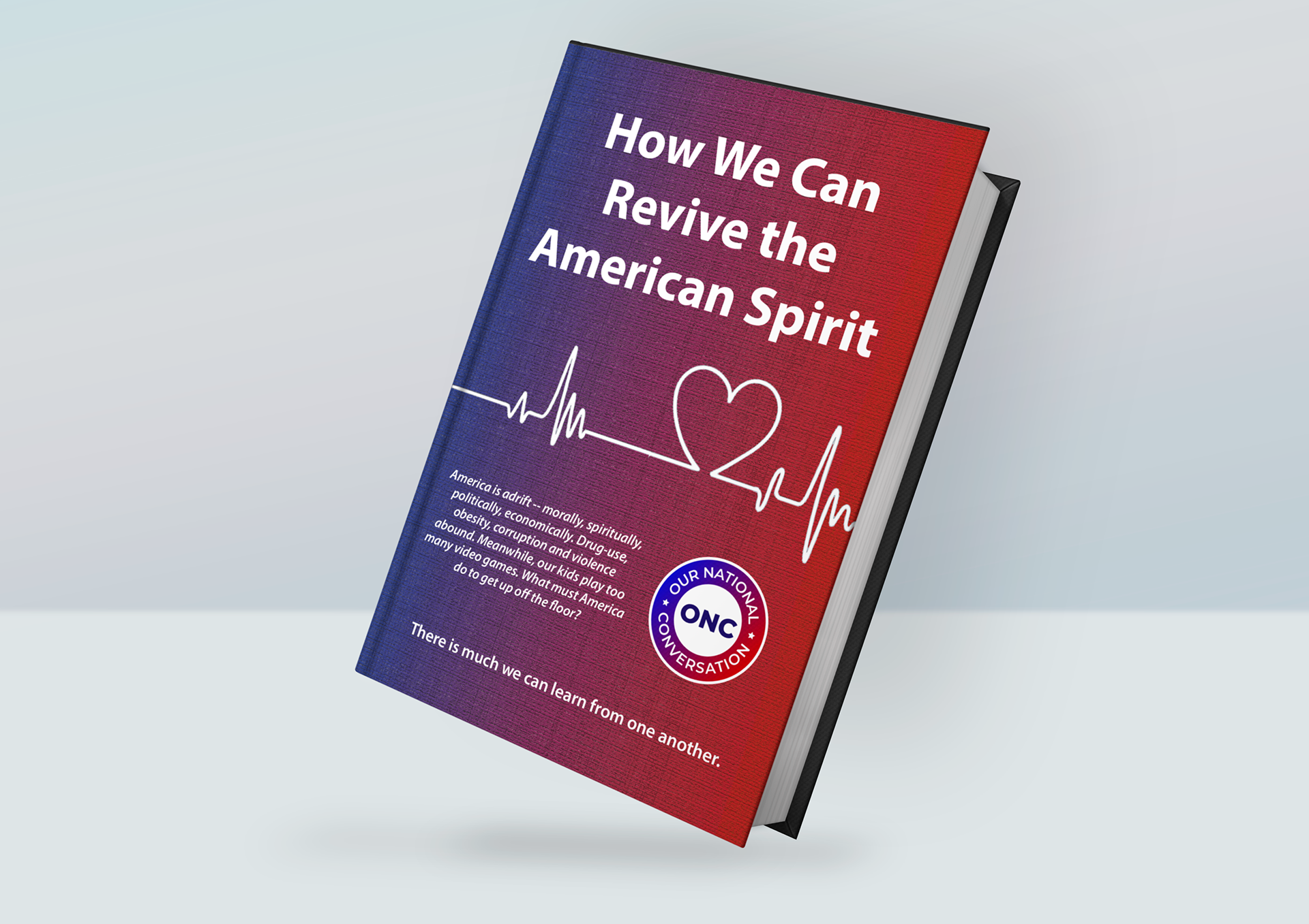
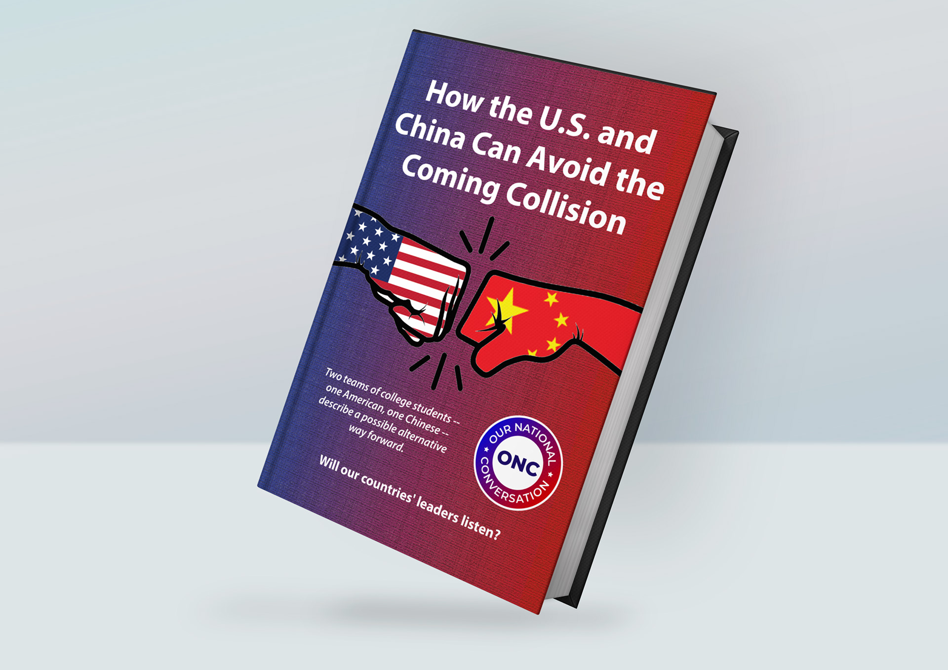
For this project, I was given the titles and copy for three books. I wanted to involve an illustration within the books because I felt that it would be a key element in attracting the attention of the audience.
I enjoyed designing these three books and I feel that I have successfully interpreted the brief in a creative manner. I presented the images as mockup files as I felt that it was much easier to imagine what the final outcome would look like when the book was fully published.
The reasoning behind using two fists touching is because I thought it relates nicely to colliding but also the 'coming together' of the two countries, avoiding the collision. I decided a line drawing of the map fit nicely to the title of 'Which Country Does It Best?' and finally, the moon is to have a visual example of the name.
I was then asked to attempt a variety of different book covers as shown below using the titles and copy I was provided with.

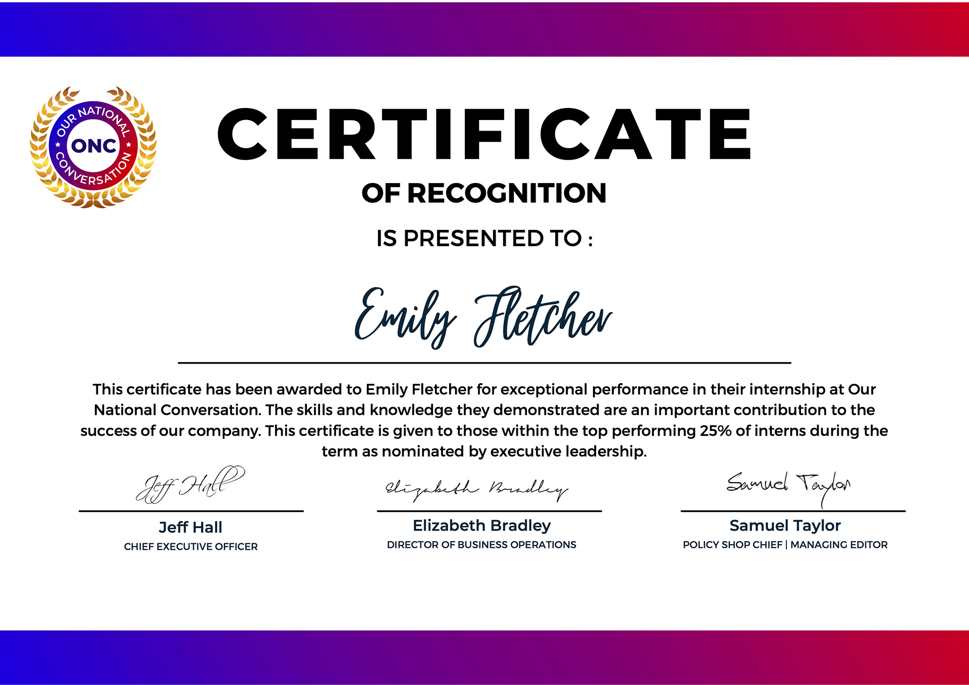
I completed my Graphic Design Internship with Our National Conversation in December 2022. I am delighted to be awarded this certificate "for exceptional performance" as it is only given "to those within the top performing 25% of interns during the term as nominated by executive leadership." I really appreciate the feedback that I received throughout my time working at ONC and I felt that my work was genuinely respected and appreciated by the company.
This was a great way to further my knowledge and understanding of Graphic Design, develop new skills around social media adverts, book front covers, newsletters, and most importantly work amongst a team of other designers.
I found it really helpful getting feedback from my Head of Technology on a regular basis, learning how to interpret briefs, and turning them from ideas to artwork in a short space of time to suit the deadlines that were in place.
Letter of Recommendation - Jeff Hall, CEO at Our National Conversation
I received a recommendation letter once I completed the Graphic Design Internship, I feel honoured to get such a great reference and I'm proud that I made such an impact within the 3 months I worked for ONC.