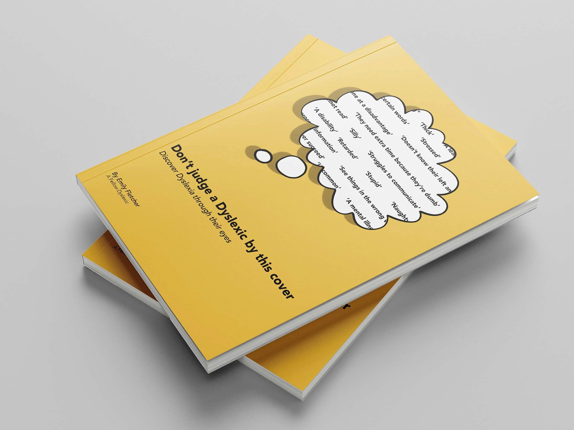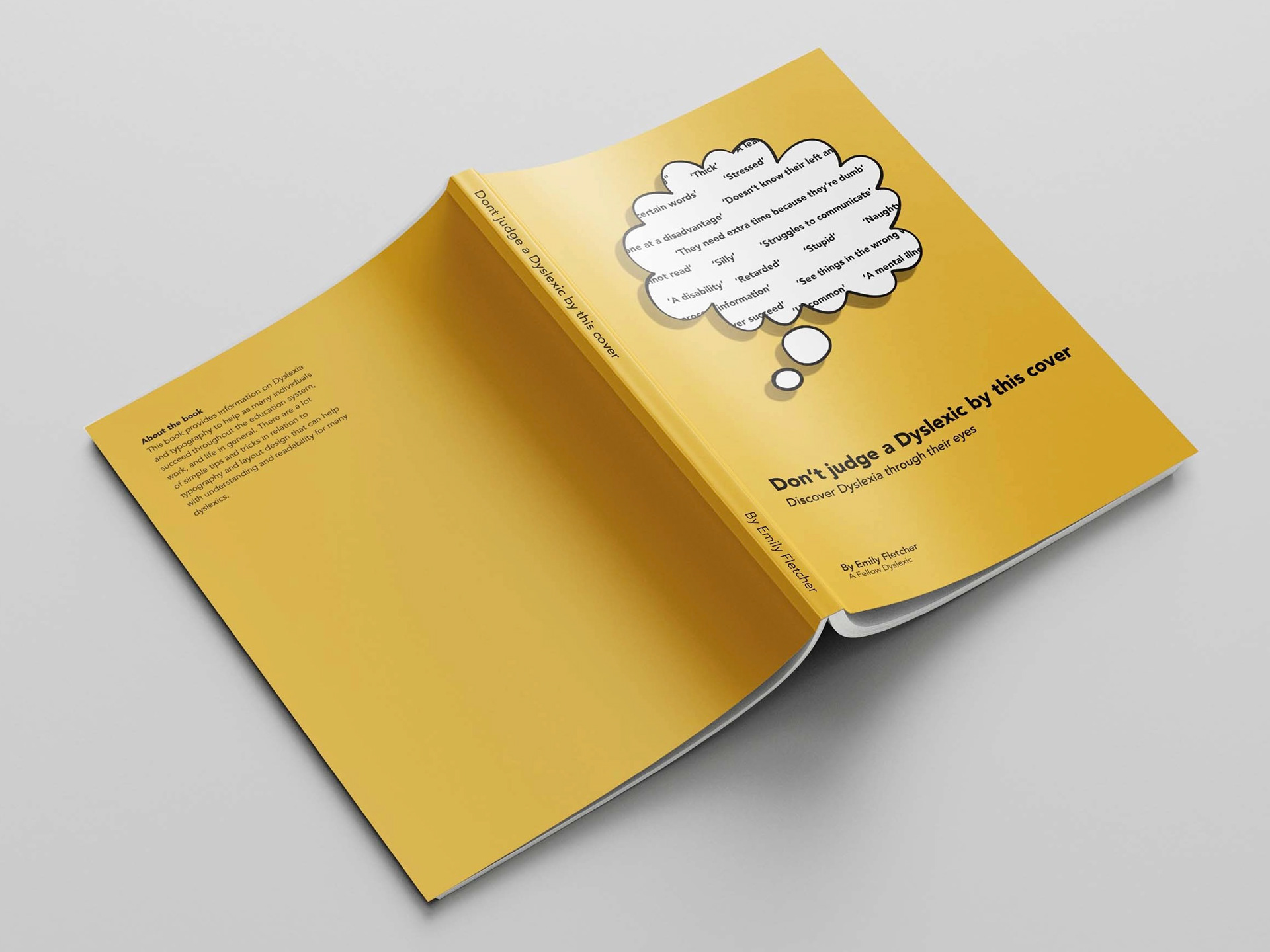
From the ISTD briefing pack, I chose ‘A Colourful Story’. We were asked to analyse and research one colour, linking it to a culture with a typographical solution that communicates the message intended for my audience- people who want to learn about how typography can affect dyslexia.
So that this module took a different route to my app design with different research, I decided to be primarily focused on typography techniques instead such as font, colour, layout, headings and writing styles with examples for each point. The information I used for this book was taken from the British Dyslexia Foundation. The name of my book design is called ‘Don’t judge a Dyslexic by this cover’ and I have added a speech bubble to the front with negative connotations surrounding the definition of the word.
I designed the book in InDesign, maintaining a colour scheme of grey and yellow throughout. I wanted to get an overlay to successfully be seen to improve readability within one of the spreads. I discovered that layering a yellow paragraph underneath a black version of the same text, (slightly out of line) would make the paragraph look busy and jumbled. Then, when the yellow overlay is applied only the black text would become visible.