I had the pleasure of working with Day 1 People on developing a new visual identity for their company rebrand. This project provided the opportunity to explore a range of design concepts and refine the company's image to better reflect its mission and values. It is incredibly satisfying to see the final result come together, and the outcome looks fantastic!
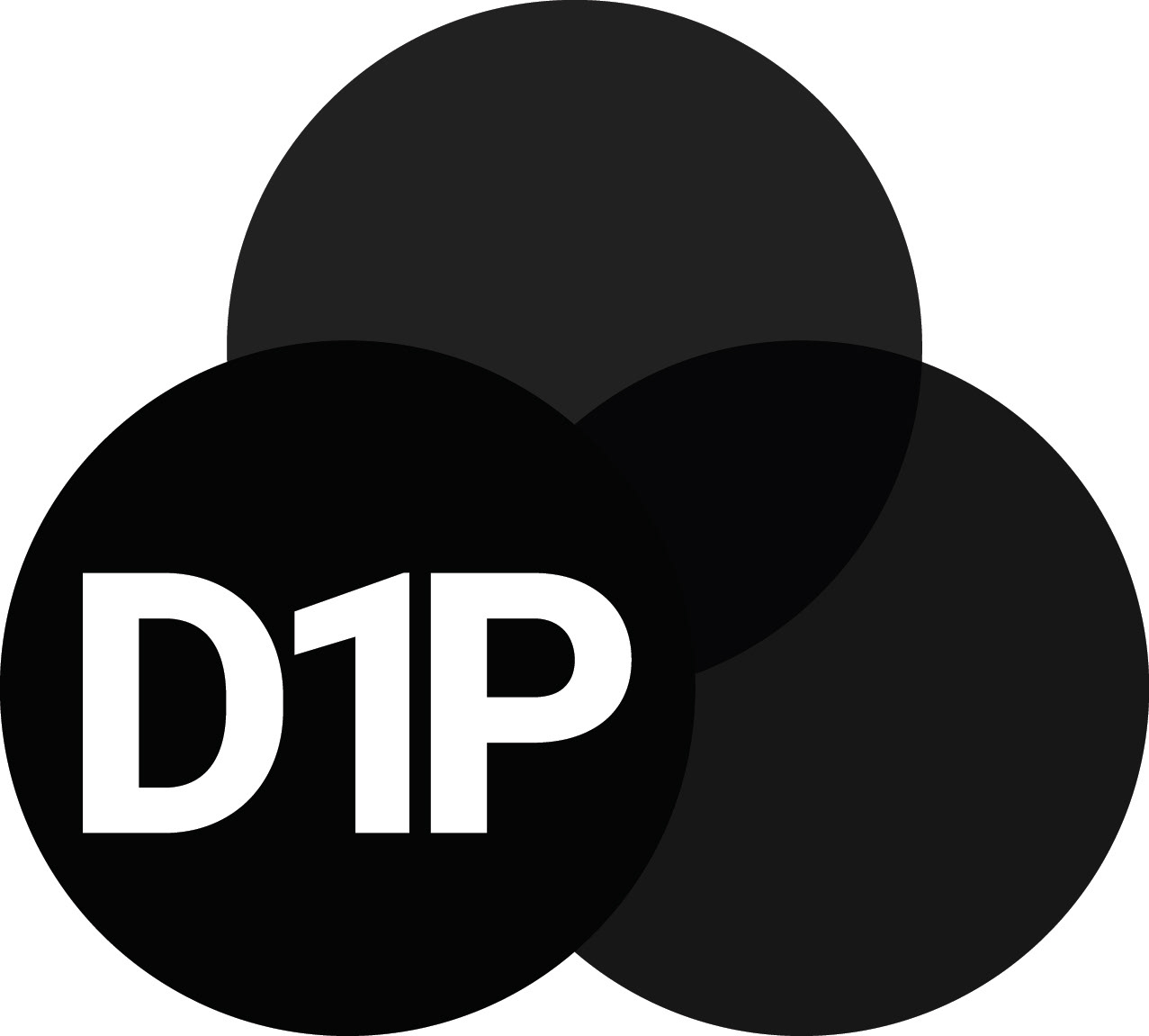
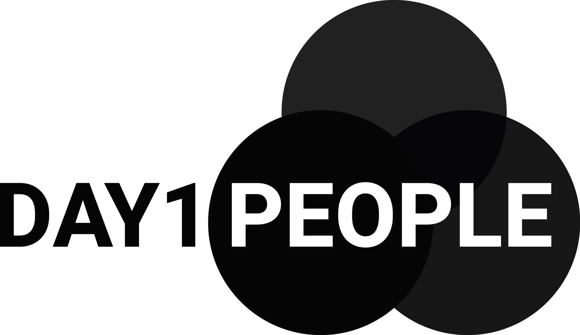
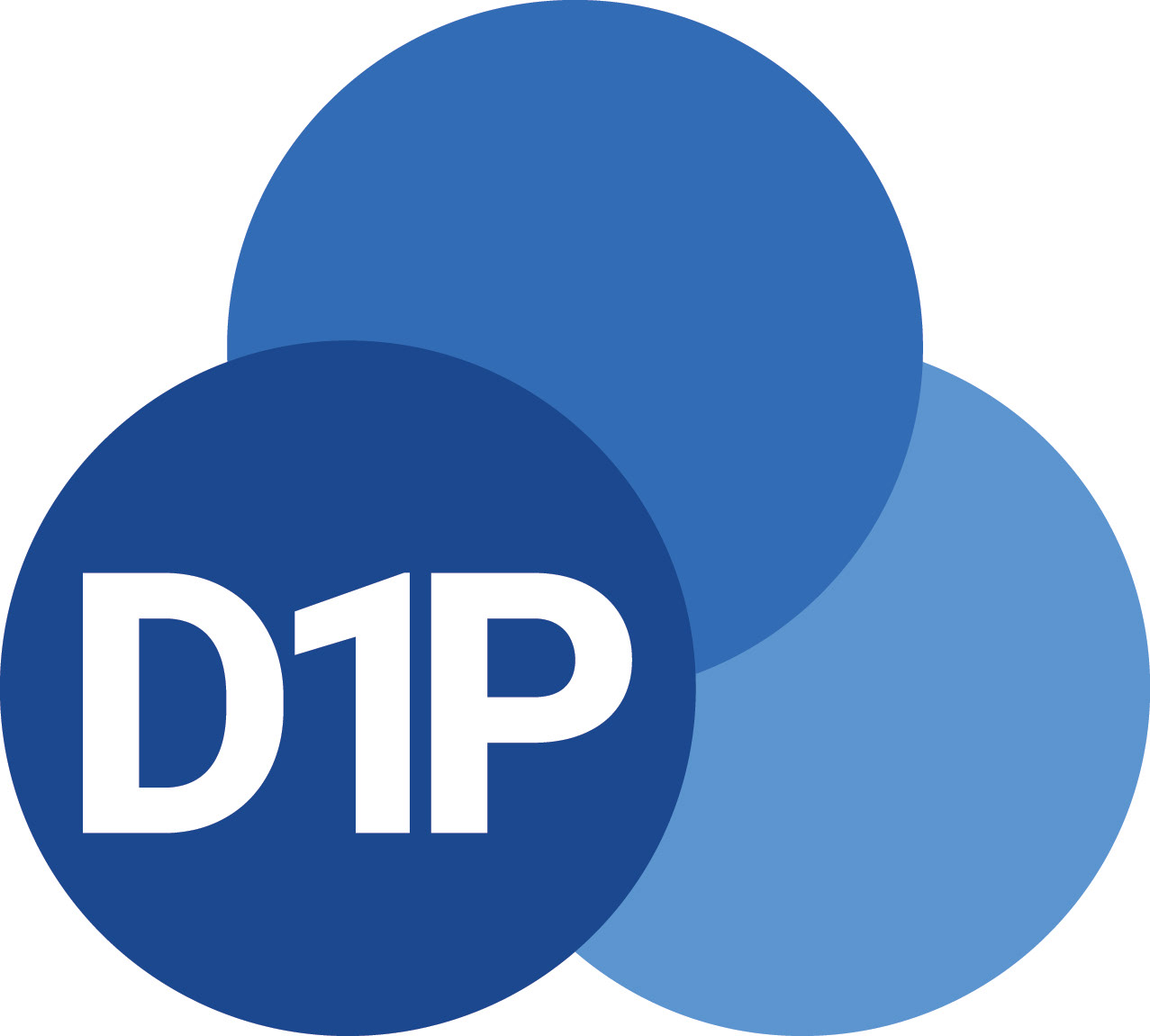

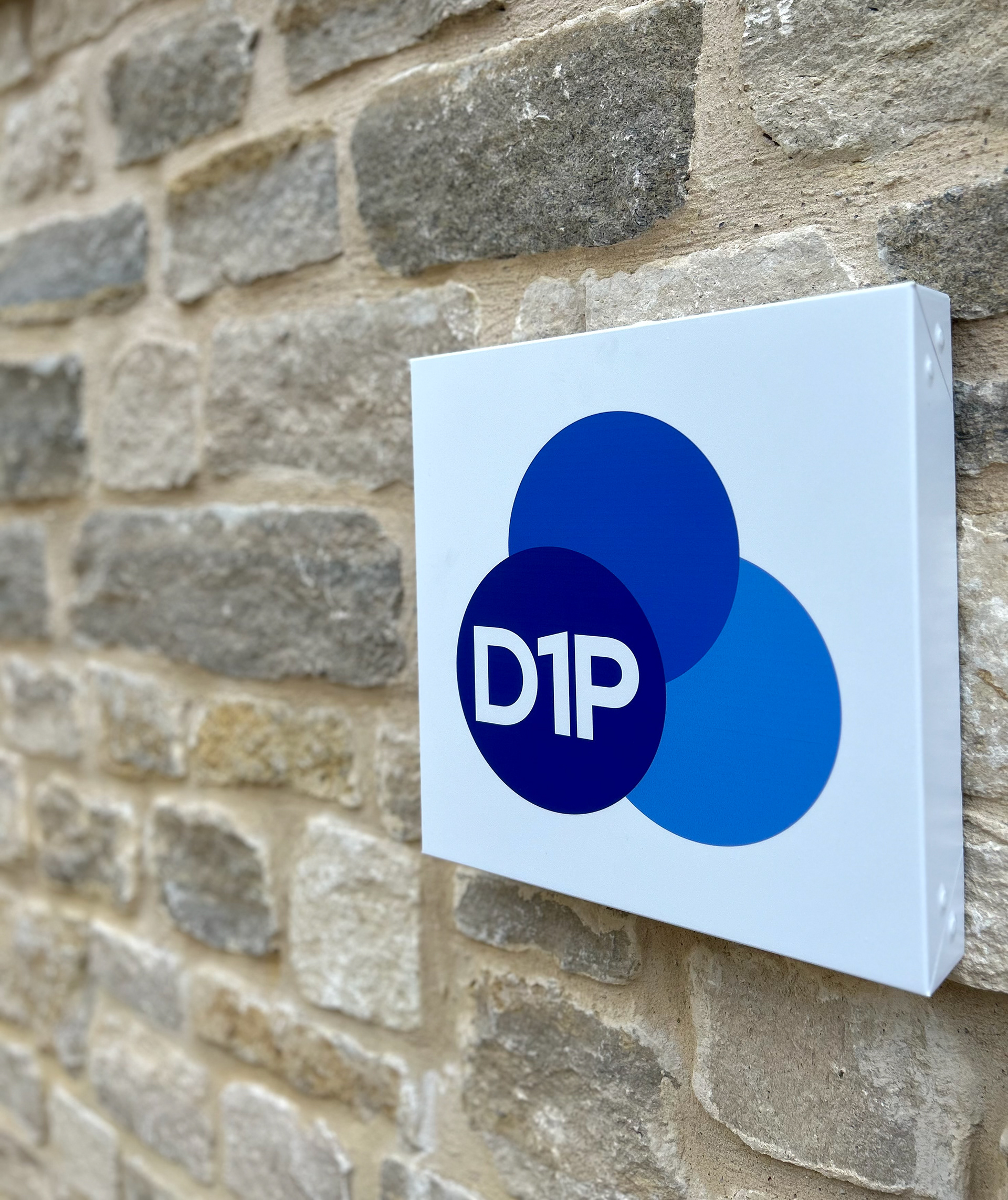
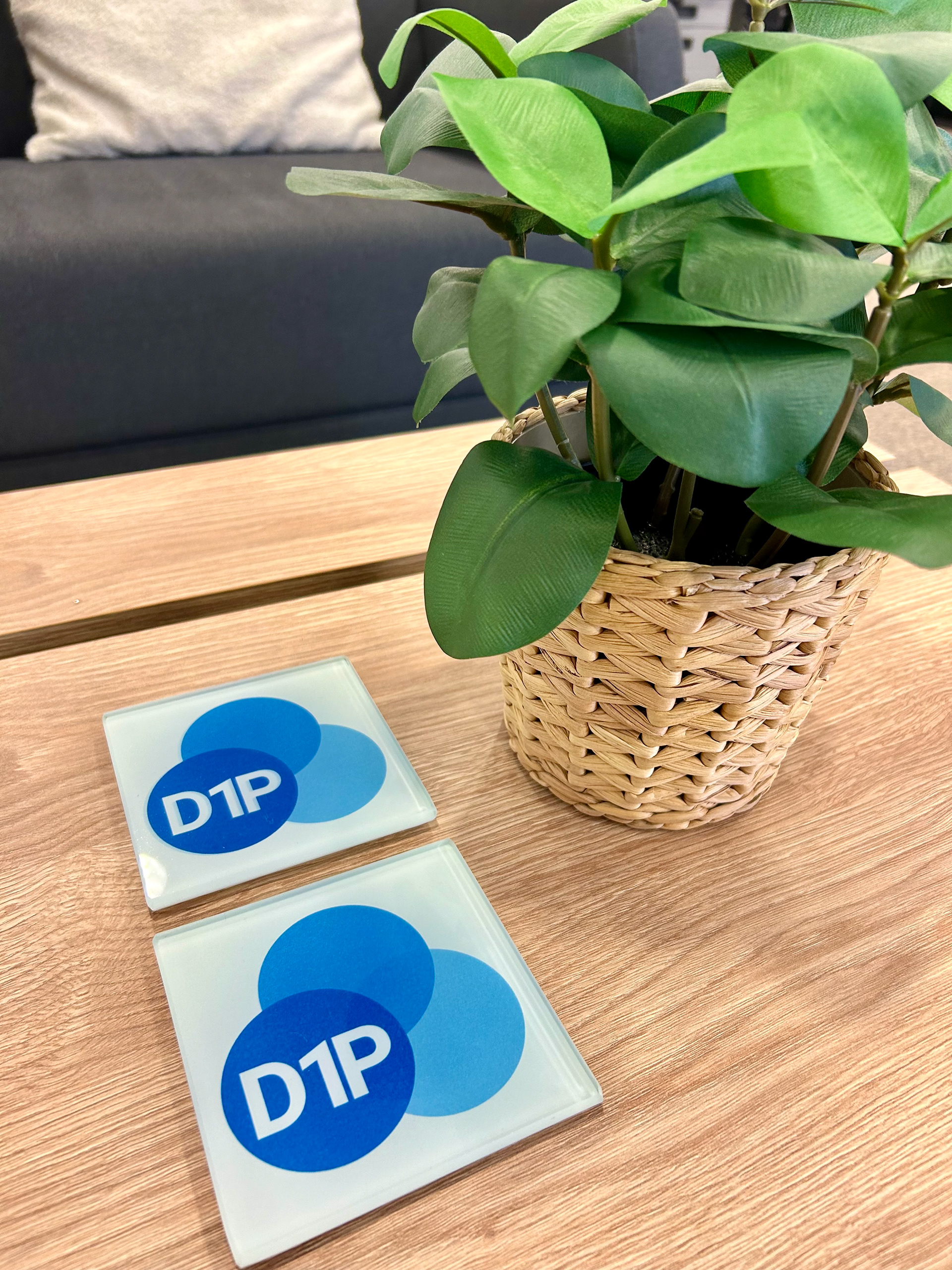
This is the original logo design they have used for the past three years. They wanted a complete rebrand, moving away from this entirely. After many design iterations, we settled on the 'Venn diagram' concept, which embodies a smart, professional, and clean aesthetic. Choosing a new colour palette also took some time, as we transitioned away from the previously used green. After careful consideration, we opted for shades of blue, reflecting their association with the military and defence sectors.

Logo Before Rebrand

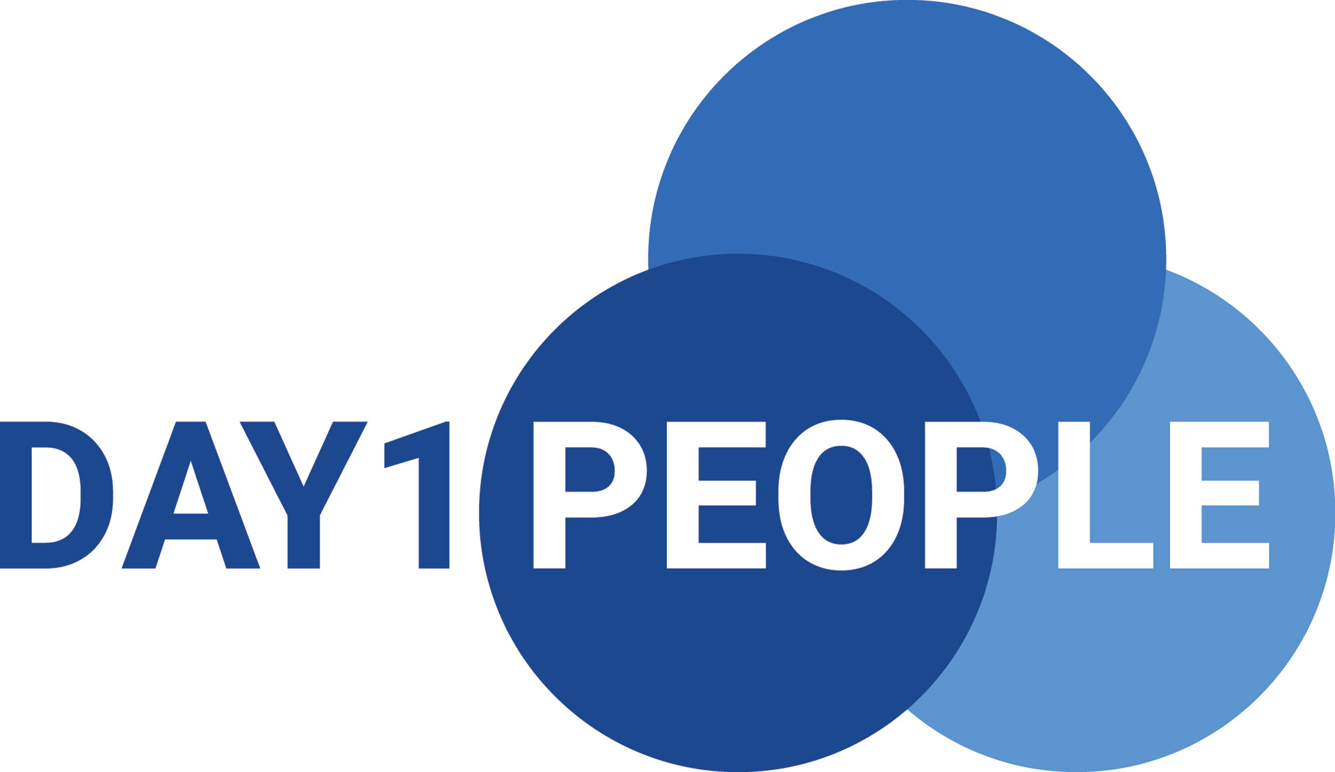
Banner Before Rebrand

Logo After Rebrand